In total, ecommerce store owners have only two seconds to grab a customer’s attention. That means your web design needs to be spectacular in order to capture visitors. The same holds true for turning visitors into paying customers. An astounding 92.6% of people feel that visuals are the top influential factor that affects their purchasing decision.
Inspiration can also come from the Best Design Awards on DesignRush website.
If you feel like your site could use some sprucing up, or you’re looking to start from scratch, the following sites should give you plenty of inspiration to step up your game.

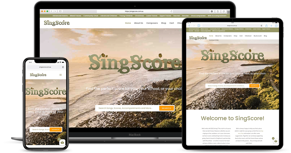
SingScore is a stunning, Australian focused choral music website. Scores are designed for choirs and groups of singers. It combines mp3 backing tracks with many of the scores. Scores can be viewed on each product page and the site has a huge selection of Australian songs. School choirs, community choirs and acapela groups can all find a great choice with lots of different parts for a wide range of vocal abilities.
Bold & Noble’s minimalistic site coincides with their simple yet chic products. The image slider on the homepage showcases just a few product images, but they highlight the of their work and how it would look in a customer’s home.
Although seemingly basic, the site encourages user engagement as they can click through sliders on the homepage and Our Story page with the navigation buttons. There’s also a buying guide that provides potential customers with information on product care and production, as well as customer testimonials.
Sometimes less is more and Shopify takes that saying to heart. Everything their visitors are looking for is offered right off the bat. Want to know what they do? They explain their service in less than 50 words. You can quickly sign up on the front page or learn about their main services by clicking on the buttons below the signup form.
While not as visually focused as product sites, Shopify does manage to include a few images. Two show off their various e-commerce products while the other puts a human face to the product. It’s a very effective design meant to build rapport with the visitors and draw attention to the various call-to-action buttons.

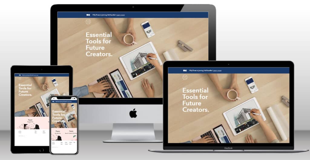
Fifty Three does a great job showing visitors exactly who they are. You can certainly read the text, but a cursory glance over the provided images shares information on the product’s feature set. Scroll down further and there’s information on the different components of the device, ease of setup, press mentions and eventually the price. By the time visitors get down to the price, the impressive attributes, shout-outs and cool design are enough for them to overlook the price tag and hit the buy button.
Still, only about 50 percent of visitors will scroll all the way down, which is the reason for the buy now button at the top of the page. The video allows users to understand the product without scrolling, while the two buy options make it easy for them to make the purchase after. The site is designed to capture the attention of people with both short and long attention spans.
Be Inspired
Take a look at some of your favorite ecommerce sites and try to figure out why you enjoy going there over other places. Compare it to what you plan on creating and see where you can find inspiration.
Well-designed sites always have the following: easy navigation, rich visuals, clear theme that communicates your company and products and clear call-to-action buttons. Test drive a couple different web design ideas and have your friends and family try them out for feedback. This way, you can find any issues before you launch, which will make it easier if you need to make any changes.
Owen Andrew is a journalist in Southern California. He is passionate about ecommerce and uses his experience to educate others.
